Everyday Chemist
Streamlined onboarding page
.png)
Who is Everyday Chemist?
Everyday Chemist is a cosmetics company that develops and customizes skincare products for brands, handling everything from ingredients to packaging. They are both a studio and a shop, offering custom formulations as well as their own skincare line.
My Role
UI / UX Designer
Team
1 Product Manager
3 UX designers
Duration
5 Weeks
Tools
The Problem
Everyday Chemist was facing the problem of low submitting rates for their product development application, which were hindering client acquisition and reducing sales. They requested that we design an onboarding process to address this issue. To better understand the problem, we analyzed the existing onboarding flow and identified several key issues with the current system.
Users drop off while filling out
the product creation form
Discovery #1
Confusing navigation to find a form
▲ Shop page
▲ Studio page
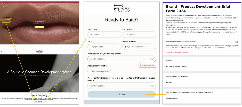
The first issue we identified was that accessing the product development application was too complicated. Users had to complete three steps, including going through two external pages, before they could even reach the form. This extra effort caused many users to leave before starting, which led to fewer inquiries and lower sales.
Discovery #2
Text heavy questions with limited visual clarity
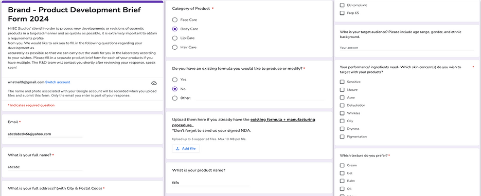
The second issue we identified was the design of the form. It contained a large amount of text, lacked clear explanations, and did not include visual elements to improve clarity. Additionally, the form had too many questions, some of which were unclear, especially for users with no prior knowledge of the field, making the process even more difficult to understand.
Competitor Analysis
Balancing Visual Appeal and Usability in Onboarding
Clear navigation with visual assets
Clear CTA

Visual asset to help user understand
Too Focused on Visuals
The accordion-style layout makes it hard to read
Overwhelming amount of information
To understand industry standards and identify improvement opportunities, I analyzed competitors' onboarding processes. Their pages were user-friendly and visually appealing. However, the design prioritized aesthetics over functionality, resulting in a confusing layout and excessive use of icons. Additionally, lengthy and numerous pop-up explanations often overwhelmed users. This analysis highlighted the importance of balancing aesthetics and usability to prevent overwhelming users with too much information.
Hypothesis
By simplifying the process and adding visuals, we believe more users will complete the application and stay engaged.
From our analysis of the product and its competitors, we observed that users struggled with the current fragmented and unstructured onboarding process. In contrast, competitors utilized more structured and visually engaging onboarding flows. Based on this insight, we assumed that implementing a step-by-step onboarding process with visual elements would enhance user engagement and increase completion rates. To validate this, we conducted user interviews to directly observe users' pain points and challenges.
User Interview
Validation & Insights

.png)
Key insights
-
User strongly desire step-by-step guidance
-
Users have a clear brand vision but struggle to communicate and translate it into a tangible product
-
Clear and consistent communication with Everyday Chemist and vendors is crucial
-
Users value a well-organized product creation process that simplifies decision-making
We conducted user interviews with five new Everyday Chemist clients to understand their experiences with the current product development process and their past experiences in product development. Our goal was to uncover their needs and expectations for future improvements. Using an affinity map and empathy map, we synthesized interview notes with team members, allowing us to identify key insights and patterns.
Personas
Tailoring for Different Experience Levels
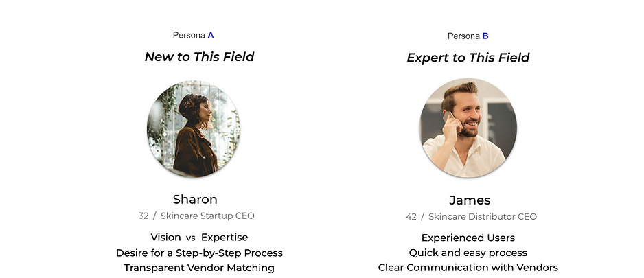
From the synthesized user data, we identified two distinct target personas: Persona A and Persona B.
Persona A is new to the field and requires a guided, step-by-step onboarding experience to navigate the process efficiently. In contrast, Persona B is an experienced professional who has previously developed products and seeks a more streamlined, flexible experience. By defining these personas, we gained deeper insights into their specific pain points, enabling us to tailor the design to meet their unique needs effectively.
User Flow
Tailoring for Different Experience Levels
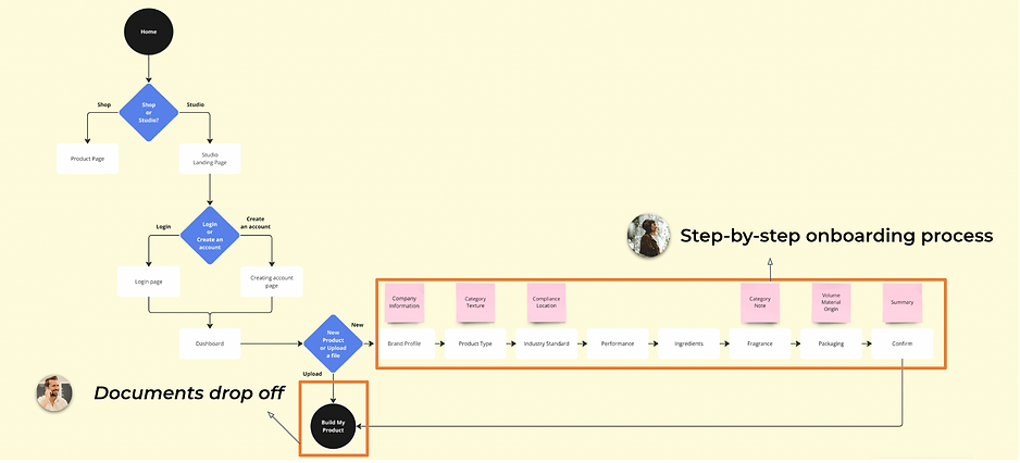
To streamline the onboarding process, we created a structured user flow to identify pain points and optimize the experience for different user needs. Through user interviews, we realized that returning clients, who already have existing files, prefer a more simplified application process. To address this, we introduced a document drop-off option and the ability to skip steps, allowing experienced users to move through the process efficiently, while still providing a step-by-step guide for first-time visitors.
Sketch
Exploring Ideas Through Sketching
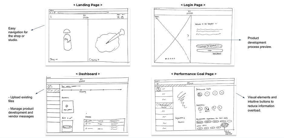
Following User Flow #2, our team conducted a sketching session where each member created a sketch and a low-fidelity screen for a key page to explore initial ideas. We emphasized creating intuitive and user-friendly experiences. Through this collaborative process, our team chose the design I created (#2). Based on our persona research, users are already exposed to a lot of information and selections, so I focused on clear navigation, simple interactions, and a step-by-step approach to avoid overwhelming them. The team agreed with this focus, and we decided to refine this design concept further.
%201.png)
Low Fidelity Wireframe
Defining Structure Through Wireframes


.png)
.png)
Building on the ideas from Sketch #2, we created low-fidelity wireframes to simplify the product development process. These basic mockups let us focus on core features and structure before moving to more detailed designs. This way, we could ensure a clear and intuitive user experience early on.
Design Iteration
EC Team Feedback :
"We would like more insight into the client's brand vision, particularly regarding visual aspects"
1st design
( Business profile page design )
.png)
Gathering general information about the user’s company
Redesign based on feedback
.png)
.png)
-
'You', 'Your Brand', 'Your Vision' : This organized approach enables us to delve deeper into understanding the users, their brand identity, and their overarching goals, providing a comprehensive view of their requirements and aspirations.
-
'Brand Mood Board' : This enables users to visually articulate their product's vision to EC with greater clarity. Users can share images, colors, and styles that reflect their brand's essence, helping EC better understand and align with their creative vision.
EC Team Feedback : "We want to keep the our current menu bar style"
Previous design

1st design
.png)
Refined design
.png)
-
Menu Bar : Initially, we planned to divide the side menu into two sections : The top section would feature the progress bar and hamburger button for the main menu, while the side menu would exclusively display the onboarding process. However, due to technical limitations and the client's preference to maintain the original side menu style, we adjusted our approach. Instead of separating the menus, we reorganized the existing side menu and added a sub-menu under the "Studio" section. Additionally, we incorporated a highlight box to indicate the user's current step in the onboarding process, making navigation more intuitive and clear.
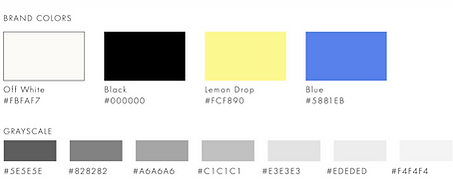
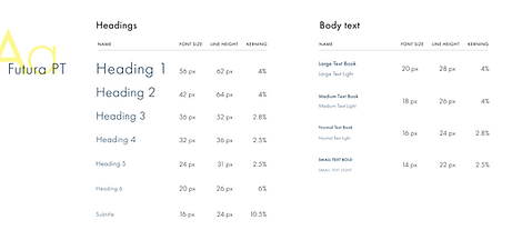
Style Guide
COLORS
BUTTONS
.png)
TYPOGRAPHY
GRID SYSTEM
.png)
Everyday Chemist already has established fonts and colors that are integral to their brand identity. Our approach ensures continuity by incorporating and organizing components while introducing galleries. This enhances the existing style guide without compromising its original integrity.
Final Design
Easy navigation to onboarding
Landing Page
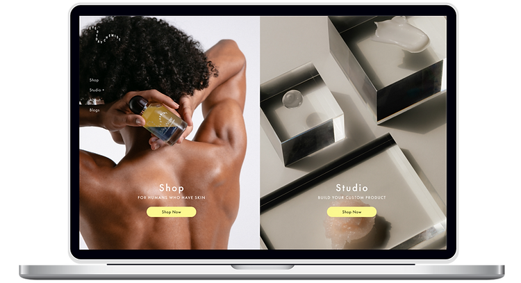
-
Reduced steps to get onto creating page
-
Achieved its business goal by showcasing both shop and studio products
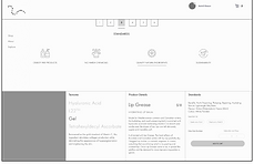
Reducing Overwhelm with Onboarding Preview
Onboarding Preview
%20copy.png)
-
Providing users with the option to preview the process or immediately start creating the product
-
Showing a preview with an image makes the process clear and encourages users to proceed without overwhelming them with too much explanation.
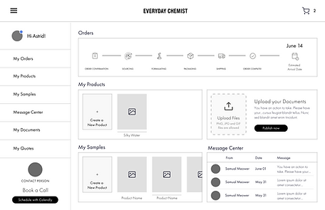
Comprehensive View of Product Progress
Dashboard
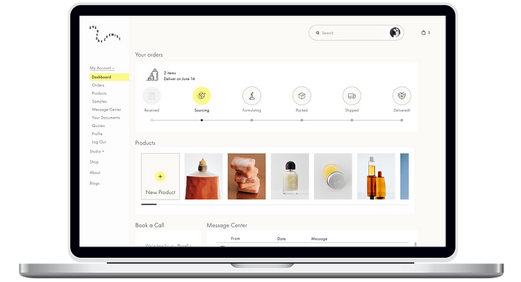
-
Quick Overview of Product Development Progress
-
Upload Files to Skip Unnecessary Steps
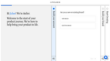
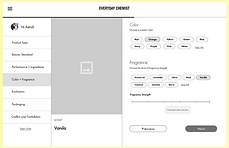
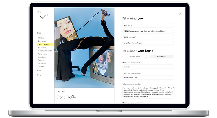
Intuitive onboarding process
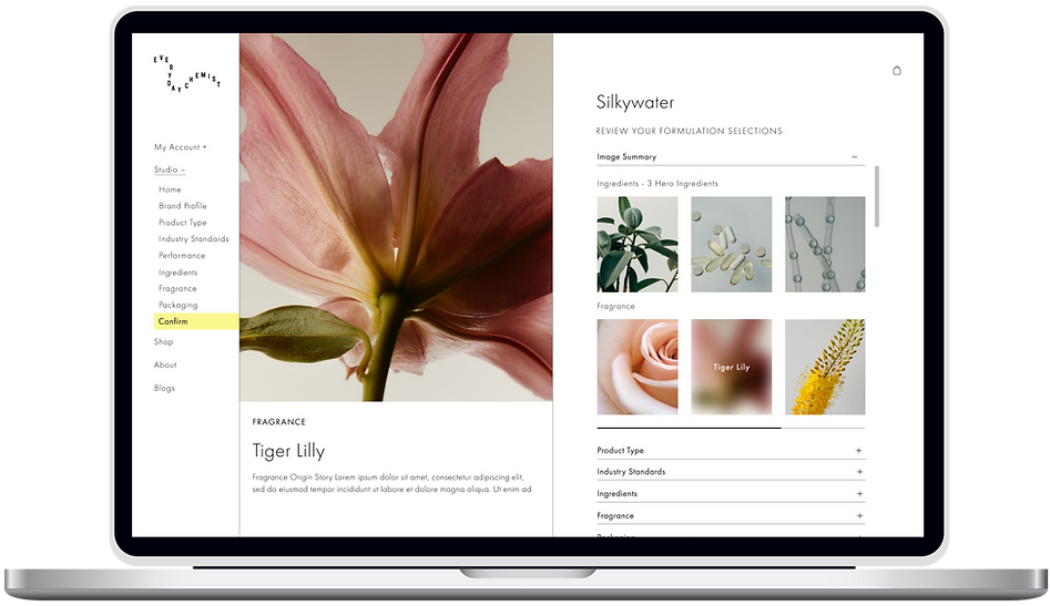
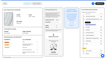
Product Development Page
.png)
-
Clear, Step-by-Step Onboarding with Visual Aids
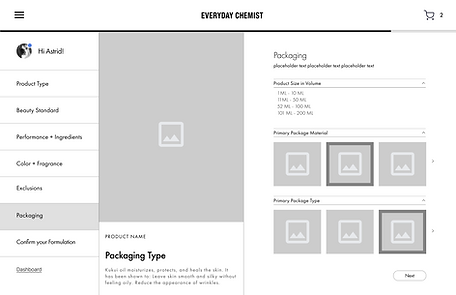
Understand users vision clearly
Brand Profile
.png)
.png)
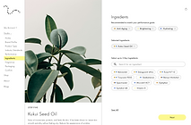
-
Mood Board Feature for Better Visual Communication with Users


.png)


Prototype
Our prototype prioritizes a clean and simple navigation system to ensure a smooth user experience. This design allows users to easily explore functionalities and features, promoting a clear understanding of the product flow without unnecessary complexity.
Reflection
Working with the cosmetic development company was a great experience, combining my passion for cosmetics and e-commerce with my prior experience on similar platforms. This alignment not only made the project exciting but also allowed me to contribute effectively to their first onboarding platform. A key takeaway from the project was the importance of simplicity in design. By focusing on simplicity, we were able to reduce bounce rates and create a user-friendly experience.